
Chart Library: Building Birst's Visualization System from Scratch
Designing a complete chart library for an enterprise BI platform, from the minimum data requirements of each chart type through the math of how charts render, configure, and degrade at scale.
Role: Lead chart designer at Birst throughout my tenure
Timeline: From my earliest days at the company through 2025, scaling as Birst transitioned from licensed charting engines to a fully in-house rendering system
Team: Primary designer across nearly every chart type; partnered closely with chart rendering engineers, PMs, and my manager; later taught the process to another designer who contributed a couple of charts
Scope: Chart concepts, minimum data requirements, sizing and spacing formulas, configuration panels, edge-case behavior, and degraded states
Status: Every chart type I designed is still live in the product today, and the library was extended into Infor's chart builder based on Birst's Visualizer
The Problem
When I joined Birst, the charting library was in its early days. The basics were covered, including bar, line, pie, and scatter, but there was significant room to grow, and customer expectations for enterprise BI were already running ahead of what we could deliver. I still remember when my manager designed the bubble chart, and the addition of a size measure felt like a meaningful step forward. That was the starting point.
Over the next decade, the library expanded significantly. Roughly three-quarters of the chart types Birst ships today didn't exist when I started. They were added one at a time, and I designed nearly all of them, from the familiar (bar, column, line, area) to the specialized (gauge, waterfall, heat map, geomap, histogram, funnel, pyramid, tree map, doughnut).
A few forces drove the expansion:
Competitive parity. Tableau, Power BI, and others had mature chart libraries. If a specific chart type wasn't in Birst's library, every deal got harder.
Customer requests accumulated over time, including waterfall for financial analysis, geomap for logistics, funnel for conversion tracking, heat map for density analysis, and gauge for KPI-centered dashboards.
Moving off licensed charting engines. Birst started with licensed third-party chart libraries. The decision to build a fully in-house rendering engine meant a slow phase-out where every chart had to be re-evaluated, re-designed, and re-shipped under the new system. A multi-year project running in parallel with ongoing feature work.
Extending into Infor. Later in my tenure, Birst's charts were adapted into Infor's broader chart builder, which meant redesigning the configuration flows to fit a different product context while preserving what made them powerful in Birst.
Process
Early on, my manager and I developed a process for how each new chart moved from blank page to shipped product. I later taught it to another designer who contributed a couple of charts to the library. Each step also produced specific artifacts that engineering needed to build the chart correctly.
Step 1: Minimum viable chart. When a user picked a chart from the dropdown, notices appeared on each data bucket the chart needed to render at all. For a bar chart, that meant one attribute (year) and one measure (profit). Most charts only needed one of each, but a few had additional requirements; bubble charts, for example, needed a third input in the size bucket. I'd start by designing the simplest possible version of the chart with just its required inputs, before adding any complexity.
Step 2: Multi-measure and multi-attribute behavior. Once the minimum version worked, I'd add complexity one input at a time. Two measures with one attribute, then two attributes with one measure, then larger combinations. For bar, multiple measures produced grouped or stacked variations, so I'd design how those looked. For pie, multiple measures weren't allowed, so I'd document that the option should be disabled.
Step 3: The color bucket. Adding a column (either a measure or an attribute) to the color bucket changed how chart elements were colored, sectioning them based on the values of that column. For bar, dropping something into color turned the bars from default-blue to category-colored. For pie, the chart already colored its slices automatically, so the color bucket got hidden entirely.
Step 4: Filter, sort, and chart-specific buckets. Filter buckets removed elements from the chart based on user selection (for example, filtering a chart of all product categories down to just Dairy and Deli) and the chart redistributed space across the remaining elements. Sort buckets controlled how data was ordered along the axis, including data-type-aware sorting like ensuring months rendered chronologically rather than alphabetically. A handful of charts also needed their own custom buckets to function (histogram needed bin or group controls, gauge needed segment definitions, doughnut needed a hole size). I'd design each of those at this stage.
Step 5: Extreme stress tests. Once the chart worked at its full configuration, I'd push it until the chart became illegible. Every bucket filled with as many columns as possible. Hundreds of data points. Mixed data types. The goal was finding the limits where the chart stopped being useful, then working with engineering to set those limits in the product. When users dragged in a column past the maximum, the UI would tell them the limit had been reached and explain why. These limits sometimes got refined after the initial designs shipped, as I tested in real environments and found new ways to break the chart.
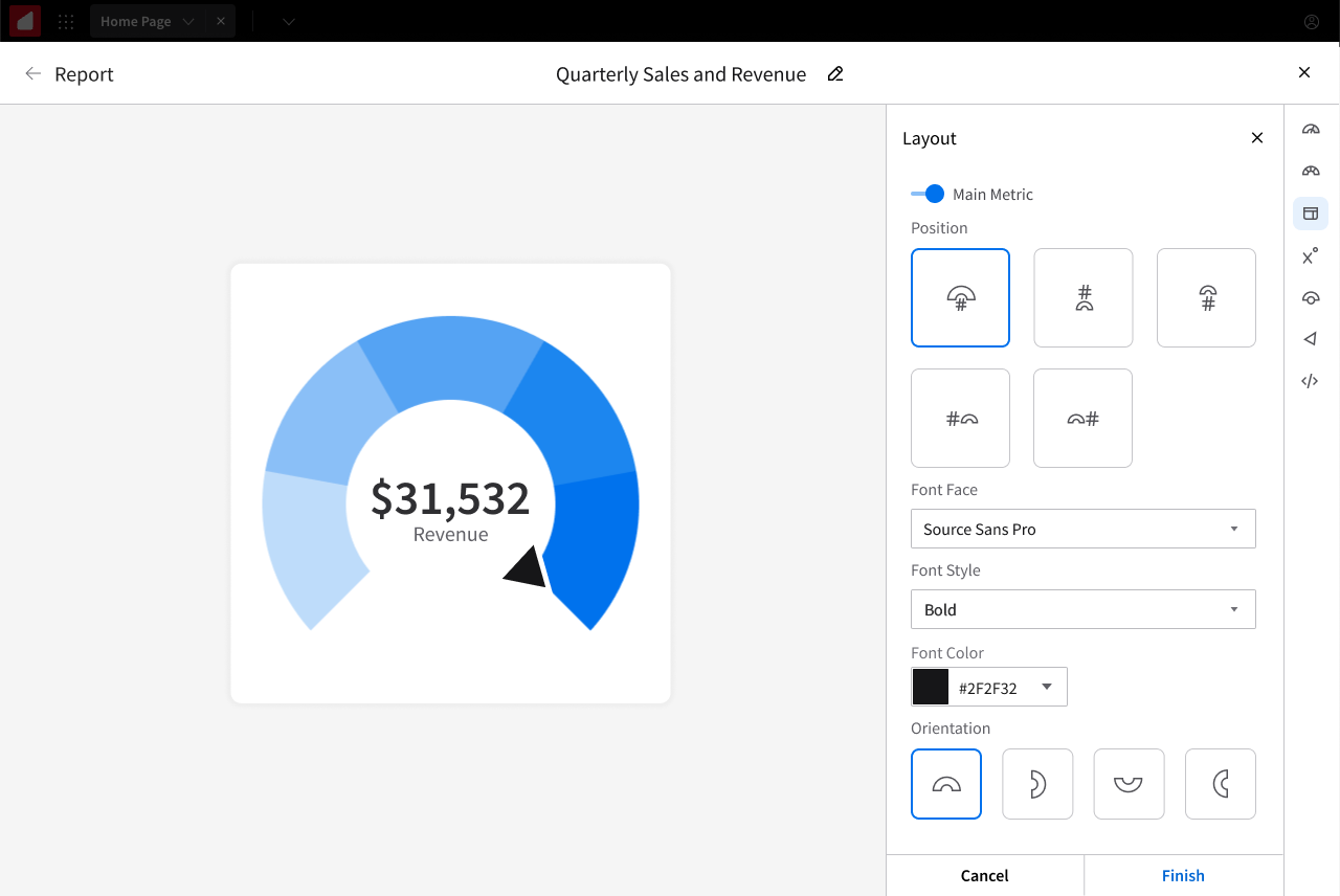
Step 6: Chart elements and refinements. With the core behavior locked in, I'd specify the supporting elements: where display values went (inside elements when they fit, outside with leader lines when they didn't), how the four degraded states (standard, reduced, basic, minimal) stripped elements progressively, where legends and axis ticks placed, and how axis lines spaced based on data density.
Step 7: Specify the render formulas. The final step, once limits were known and elements were placed, was finalizing the spacing ratios and element sizing formulas with engineering, which I'll get into in the next section.
Most charts took about two weeks of mockups plus a few weeks of engineering, with testing done against POCs during development. Charts with deeper configuration complexity, like gauge, required significantly more time on both the design and engineering sides.
Standard
Reduced
Basic
Minimum
How the library actually scaled
The seven-step process worked because the standards I set early were trusted as the library grew. Engineering, PMs, and my manager accepted the formulas and degraded states without re-litigating them for each new chart. Once a chart shipped under the established patterns, the next chart inherited them. Adding the geomap, the funnel, the waterfall, the tree map, none of those required convincing the team to use ratio-based render formulas or the standard-reduced-basic-minimal degraded states. The decisions were already made.
That trust dynamic mattered for scale. A chart library where every formula and every spacing rule had to be defended on every new addition would have moved at a fraction of the speed. The standards held because the original work proved itself in production, and once that proof landed, the team gave me room to extend the library without bottlenecks. The internal wiki I maintained became Birst's reference for how charts should render, and every new chart added during my tenure followed the patterns I established there.
Working with engineering: the math of a chart
Designing a chart library at depth means specifying the math of how charts render. Birst's customers ran the product on every kind of monitor, browser, resolution, and aspect ratio you can imagine. On top of that, users could size a chart anywhere from a tiny tile on a dashboard to a full-screen view, all within the same session. Fixed pixel values didn't work in this environment. Almost everything had to be specified as a ratio that scaled with the chart's bounds.
Examples of what I specified with engineering:
Bar width and gap behavior. Bar width was a function of available canvas space divided by the number of bars, with consistent gap-to-bar ratios that held up whether a user was looking at five bars or fifty. For grouped or stacked variants, the formula extended to handle inner-group spacing and outer-group spacing, all scaled together so the chart felt visually consistent at any size.
Line and dot proportions. Lines and dots were specified as ratios to each other (lines one unit thick, dots two units), and both shrank proportionally as data density increased. In a multi-line chart with many measures, this kept every line distinct and visible without overlap.
Trellis charts and the nested trellis problem. Any chart could become a trellis chart by dropping a column into the trellis bucket. Charts could trellis vertically, horizontally, or both. I designed how the chart builder displayed a default number of trellis cells before scrolling activated, and how each cell scaled relative to the others. I also worked on an experimental nested trellis feature, where multiple columns could trellis together to create cell combinations across hierarchies (for example, Continent → Country → State → City). The challenge was that nested trellis exhausted every possible combination of those values, including combinations that didn't actually exist in the data. A city in one state nested under a different state would render as a broken cell. Working with engineering, I helped identify the pattern, and we shipped logic to remove entire empty rows and columns from the trellis grid. Cells that fell inside a populated row but had no matching data still had to display as labeled empty cells (otherwise gaps would appear in the grid), but those were now annotated with a clear notice explaining that no data matched that combination.
Fixed-pixel exceptions. A handful of design elements were specified as fixed pixels rather than ratios because they didn't scale meaningfully with chart size, like the thickness of the box outline on a box-and-whiskers (box plot) chart. Those exceptions were documented explicitly so engineering knew when to use ratios and when to hold fixed values.
Axis labels, legends, and tick spacing also had their own scaling rules, but they followed the same underlying principle: every element had to know how to behave at every chart size.
These decisions are documented on an internal wiki that has been the golden standard for how Birst charts render from the beginning of the library's development.
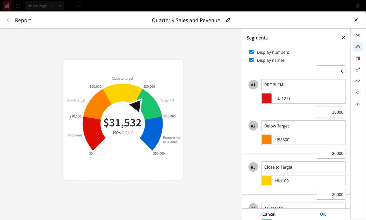
The gauge segment-boundary decision
Gauges need segmented ranges. For a profit gauge, segments like "Problem," "Below Target," "Close to Target," "Target Hit," and "Bonuses for Everyone." The question is how users define those ranges.
The obvious approach, which everyone initially assumed I'd use, is to ask users for the numerical size of each segment, so they'd type how big each segment was supposed to be. The problem is that segment sizes don't tell users where on the gauge each segment lands. To know whether their final segment ended at the right target number, they'd have to mentally add up every segment along the way. And because sizes are inherently positive, this approach also made it impossible to define a gauge that started below zero.
I chose a different approach. The inputs for each segment sat directly on the dividing lines between segments, so each number represented the endpoint of one segment and the starting point of the next. Users defined boundaries, not sizes.
PMs and my manager pushed back at first, but once the team saw why it mattered, the room collectively clicked. Gauges that needed to start at negative values worked correctly. The math stayed clean for users, who could place a boundary at any value they cared about (like "25,000 is the close-to-target threshold") rather than computing segment widths.
Gauge shipped and became one of the most popular chart types in the library, especially among executives tracking revenue and operations users tracking throughput.
Deep dives - two charts worth featuring
Gauge: configurability without overwhelm
Gauge had the most configuration options of any chart in the library because it was the most semantically flexible. The same gauge could track anything from a CEO-facing revenue target to a warehouse's inventory levels.
Configurations included:
Orientation. The gauge could be rotated to open in any of four directions: upward, downward (the default), leftward, or rightward.
Angular span. Full-circle, fan-shaped, or anything in between, selectable from preset angles or set to a custom angle defined by the user.
Hole size. A slider controlled the gauge's center hole, affecting both aesthetics and label positioning.
Segment boundaries. The boundary-input system described in the previous subsection.
Overflow segment. An optional "you went over your target" segment that only appeared when actual values exceeded the user-defined max. When overflow wasn't toggled on, the final segment scaled up infinitely as values grew past the target, so the gauge kept showing the right information at a glance.
Label positioning. Center number, above, below, left, right, with logic for when a small hole size forced labels to reposition automatically.
Pointer style, font, color. Standard configuration.
Display value toggles. Let users show or hide segment range values and segment names.
Configuration happened through a well-organized side panel, giving users full control over a genuinely flexible chart type.
Doughnut: the "Other" slice
Doughnut had a subtle design problem. Too many slices made it illegible. For a category with 30+ values, a doughnut became a messy ring of tiny slivers that told no story.
The solution was an "Other" slice. Users could specify how many slices they wanted displayed at full detail, and everything beyond that count automatically folded into a single "Other" slice with a hover tooltip that displayed everything inside it. No data was hidden, just summarized. The pattern later applied to pie charts too.
Designing for edge cases
Enterprise BI data is messy, and a chart library lives or dies based on how it handles edge cases.
Missing data became dotted lines in time-series charts, so users could see gaps rather than assume zero values. Layer ordering was solved with a simple layer-order control after we discovered that area could hide lines in combo charts. Predictive indicators let users forecast future values based on trend analysis, with the forecasted segment rendered visually differently from historical data. Failure-state notifications appeared at the top of charts that couldn't render, explaining why and suggesting what to change. No silent failures.
One stress test worth mentioning, I explored whether gauges could support multiple measures at once. The mockups got interesting, but a gauge is semantically a single-value display. Forcing multi-measure undermined its core purpose. The right answer was "don't add the feature," which is its own kind of design decision.
Outcome
The library was extended into Infor's chart builder, reaching a much wider user base than Birst alone. The configuration flows were redesigned to fit Infor's product context while the underlying chart logic, the render formulas, the degraded states, and the bucket behavior carried over directly.
Every chart type I designed is still live in the product today.
Gauge became a favorite among executive and logistics users, used to track revenue targets, inventory levels, customer-satisfaction metrics, and more.
Sizing and rendering rules became company standard. My mockups are documented on Birst's internal wiki as the reference for how charts should render, and every new chart added after I stopped being the primary designer followed the patterns I established.
Reflection
Designing a chart library changed how I read data. After spending years designing charts, I see the design decisions inside every chart I encounter, from articles that use a chart type that's wrong for their data to dashboards that would tell a clearer story with a different visualization.
Chart design also taught me the difference between design craft and design specification. On a one-off screen, you can iterate until it feels right. On a chart library, you have to specify behavior that will apply thousands of times across inputs you'll never see directly. The formulas have to work at the extremes. The configuration options have to make sense for users who know far more about their data than you ever will.