

GenAI
Integration across Infor Birst
Designing prompt-driven AI features into the Birst analytics platform during the company-wide GenAI integration push, contributing to roughly ten features and helping define the interaction patterns for how AI lives alongside manual input.
Role: Design Lead on specific features within a collaborative effort
Timeline: 2023 through 2026
Scope: Direct design ownership of approximately 10 GenAI features across the Birst platform, plus collaborative work establishing the interaction patterns the Birst design team standardized for AI use
Team: Three Birst design team leads (myself plus two peers), supported by four additional designers in India; partnered with Infor's central design team, who provided AI-specific UI components
Status: Several features shipped; others designed and approved for production at the time of my departure, currently in development
The context
Infor's GenAI integration was top-down. Executives and product leadership across the company pushed for AI features to be incorporated into existing functionality and into every new feature in the pipeline. The mandate hit Birst in 2023, and the team responded with an all-out integration push. PMs requested AI elements wherever they thought one might add value, and design tickets started flowing to our team weekly.
Infor's central design team owned the AI visual layer. They provided the generate buttons, the AI disclaimer copywriting, the GenAI icon, and the differentiated colors that signaled AI-driven actions throughout the product. What they didn't provide was the interaction architecture for how those components fit together in real flows.
That gap is where the Birst design team did its most consequential work.
What Infor actually gave us
Infor's central design team's AI assets were minimal at the time. We received an AI icon, a Generate button, a differentiated color for AI-driven actions, and the standardized disclaimer copy reminding users to verify AI output. That was effectively the whole kit.
There were no patterns established for how those components fit together in real flows. The closest thing to a reference was a simple example showing a prompt box on top and an output box below it. Two separate fields. Implementing that pattern across the product would have forced every text input that received AI integration to become two boxes instead of one, which cluttered every screen and made it look like users were being forced to interact with AI even when they weren't. With our wide range of customers and the different user types within each one, that wasn't the right default. Advanced users who already knew what they wanted to type would have been pigeonholed into a UI built for AI users.
The Infor design team's AI work at the time was rudimentary, mostly sparkly buttons and the input-output box pattern, with no established interaction language. We had to design the rest ourselves.
How the work was distributed
Each week, the three of us at the team-lead level (myself and my two designer peers) met with the four additional designers in India to triage incoming AI tickets and assign them based on complexity and proficiency. The lead designers took the more complex features. The remaining work distributed across the team based on familiarity with the affected product area.
Across the GenAI integration as a whole, I directly designed approximately 10 AI features end-to-end, contributed to others as a reviewer and pattern-setter, and mentored the associate designer on his AI work. The features I owned varied widely in scope, from a chart generator that lived inside a single dashboard modal to a prompt-to-code feature that fundamentally changed who could write Birst's custom query language.
I did some much needed coaching with the associate designer about AI use. It was about analyzing where AI actually belonged. He had a tendency in early projects to apply AI broadly across features that didn't need it. I worked with him on a framework for deciding what was worth AI integration: hyper-specific use cases first, then expanding only when it was clear the AI was solving a real problem rather than peppering AI presence across the product for its own sake. We started an internal asset sheet for AI features the team had designed but Infor's central team hadn't picked up yet. We pulled from Infor's library when their components fit, but we built our own when they didn't.
Filling the interaction/pattern gap
The Infor input/output box pattern was technically the path of least resistance. PMs and engineering had written feature specs around it, since adding a second input field was trivial development work, connect a prompt to an LLM, output to a separate field. We pushed for a different approach.
The argument for the two-box approach was speed and simplicity. The argument against it was everything else. Every screen that received AI integration would have to expand to fit a second box, the cognitive load on users would increase for a feature that was supposed to streamline their work, and the AI would feel surfaced and forced even for users who didn't want it. Our wide customer base included both technical users who knew exactly what they wanted to type and less technical users who wanted AI to help. The two-box pattern was the worst of both worlds.
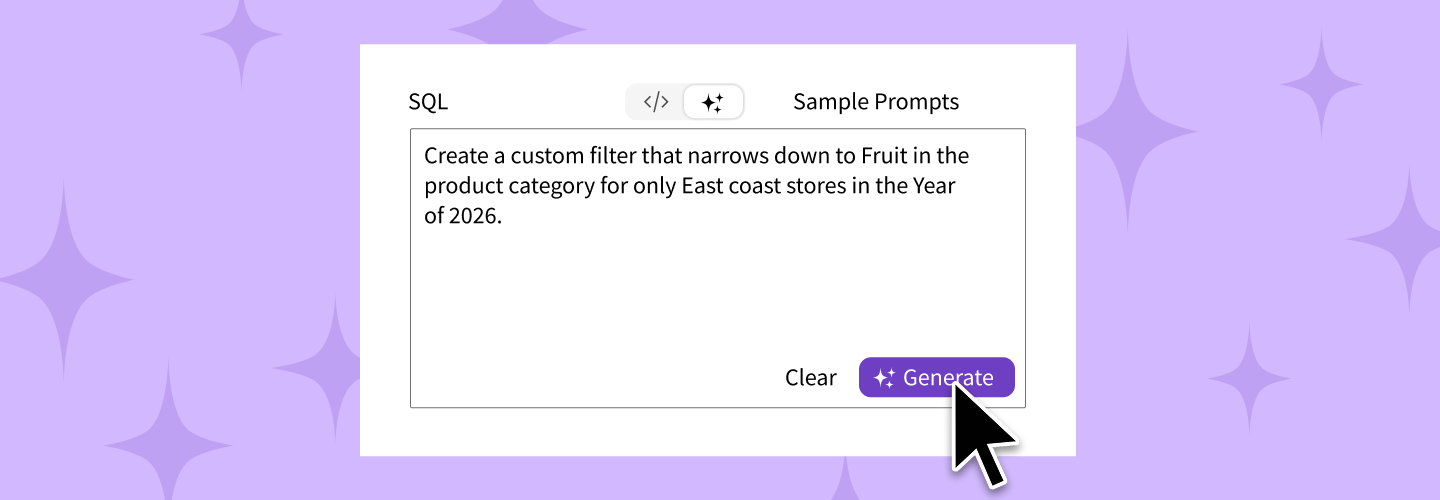
We built a prototype showing an alternative: a single text field where users could either type manually or generate with AI, controlled by a segmented controller above the field. We presented this to PMs, who agreed to back the redesign before we built out a reusable pattern.
The pattern itself took iteration. We brainstormed multiple approaches first. One early idea was a popover with a caret pointing to a Generate button on the side of a manual text field, but that broke design patterns we were already maintaining. We didn't want carrots on a modal, since modals were already a frequent layer in the product, and adding the popover layer on top of that would have meant three layers stacked. The transfer of generated output from a popover back to a field below felt clunky and disconnected. We strayed from that approach.
The segmented controller landed because it solved every constraint at once. The user chose Manual to type directly into the field, or GenAI to type a prompt and click Generate. The AI's output replaced the prompt in the same field, switching the controller back to Manual so users could edit by hand. One field. One source of truth. Three modes, with no clutter.
The original design assumed users would accept the AI's output as-is. The aha moment came when our manager looked at the mockups and asked if users could edit the result by hand. We hadn't designed for that. Adding editability after generation turned out to be the missing piece that made the entire pattern work. Users got the speed of AI when they wanted it and full control over the output when they needed it. That single addition shaped how every subsequent AI feature on the team handled output.
It took us roughly a month to standardize the flow across the team. We worked on it on and off alongside our individual feature work, refining as we went. Once locked in, we handed it off to developers as a reusable component for use across the platform.
Features I designed
Generate chart
from prompt
A user opens a dashboard, enters edit mode, and clicks the plus icon to choose to add a new chart. Instead of opening the Visualizer chart-builder, they choose the "Generate chart" option to bring up a modal with a prompt input at the top and a blank canvas below where the generated chart will render. The user types what they want, clicks Generate, sees the chart render in the preview area, and can either insert chart and place it on the dashboard or refine and regenerate.
The design problem here was making AI feel like a natural alternative to opening the full Visualizer product, not a separate workflow added on. The user shouldn't have to learn a new skill just because they're using AI. The flow mirrors the manual chart-creation flow but compresses it to one prompt and one preview.
Why the chart generator lives in a modal, not in Visualizer directly:
The chart-generation feature came from customer requests filtered through PMs. The story was specific: customers often wanted to generate a chart for the newest quarter or month and place it on a dashboard, replacing the previous chart. The existing flow required them to open Visualizer, create a new chart, save it, return to the dashboard in edit mode, delete the old chart, add the new one, and publish. They could have edited the existing chart directly but that still required opening Visualizer and updating the underlying columns. That whole flow could take five minutes for what should have been a fifteen-second operation.
The modal compresses this to one prompt and one preview. The user enters edit mode on the dashboard, clicks the plus icon to add a new chart, chooses Generate chart, types what they want, and clicks Generate. The chart renders in the modal's preview area. Insert chart places it on the dashboard at the size and position the user chooses.
The modal had to be a modal because dashboards came in many sizes. Some dashlets were too small to comfortably host a prompt-and-preview flow in place. The modal focused the user's attention on the chart being created without competing with the dashboard's layout constraints.
Prompt to
BQL
BQL is Birst's custom query language, similar to SQL but with built-in formatting, auto specifies dimension and attribute, bracket helpers that made it easier than raw SQL to write queries, and more. Even with those affordances, BQL still required some technical proficiency. The bar to entry was real for casual Visualizer users.
Prompt-to-BQL eliminated that bar. A user could type what they wanted in plain English ("filter to all bedroom and living room furniture, within the furniture category, combined into a single attribute"), click Generate, and BQL code would appear in the editor. The user could use the result as-is to create a custom column, measure, attribute, or filter, or they could edit the generated code by hand with the already built-in predictive layer in BQL.
I designed two implementations of this feature. The first lived inside Visualizer, where custom expressions are created within Birst. The second was a parallel implementation built for Infor's own product, which extended the same AI-driven BQL authoring flow into Infor's broader analytics surface. Both versions used the segmented-controller pattern described above. The space aaffordance alllowed for the displaying of the users natural language prompt, as well as the BQL code it generated. Generated code populated a field below the prompt because we had plenty of real estate to fit everything. The user could refine the prompt or edit the result manually with the standard BQL editor.
The accuracy was strong on simple queries. Complex queries occasionally produced ordering or combination issues that a user could correct manually before applying. The design philosophy was always to assume the user might need to edit the result, never to lock them into the generated output.
The BQL editor we were generating into was already enhanced with predictive helpers, dimension and attribute auto-specification, and bracket helpers that made manual editing easier than raw SQL. AI generation slotted into an editor that was already designed to assist users. If AI's output had ordering issues on complex queries, users could swap items in the string while preserving the structure. The editor's existing scaffolding made editing AI output feel like editing their own code, not like patching something foreign. The accuracy limitations we knew existed didn't slow the feature down because the editing experience around the AI was strong on its own.
My Infor BQL design
My Birst Visualizer BQL design
AI-
generated descriptions
Saved expressions, saved reports, and saved filters could all benefit from a description so other users on the team understood what they were looking at. Manual descriptions were often skipped because writing them was tedious, and a missing description made shared assets harder to use.
I worked with the associate designer to design a description-generator that used the existing context of the saved item (its formula, its inputs, its applied filters) to produce a description automatically. The user could click Generate to populate the description field, edit it manually, regenerate it, or skip it entirely. When viewing a saved expression in the library, the description appeared inline on the cell with a description icon, expanding into a tooltip on hover. Other places used an information panel or a modal.
This was one of the features where I mentored the associate designer rather than designing alone. My contribution was establishing the flow patterns, reviewing his work against the team's standards for AI components, and ensuring the description generator followed the same prompt-and-edit philosophy as the rest of our AI features.
Impact Flow
AI chatbot
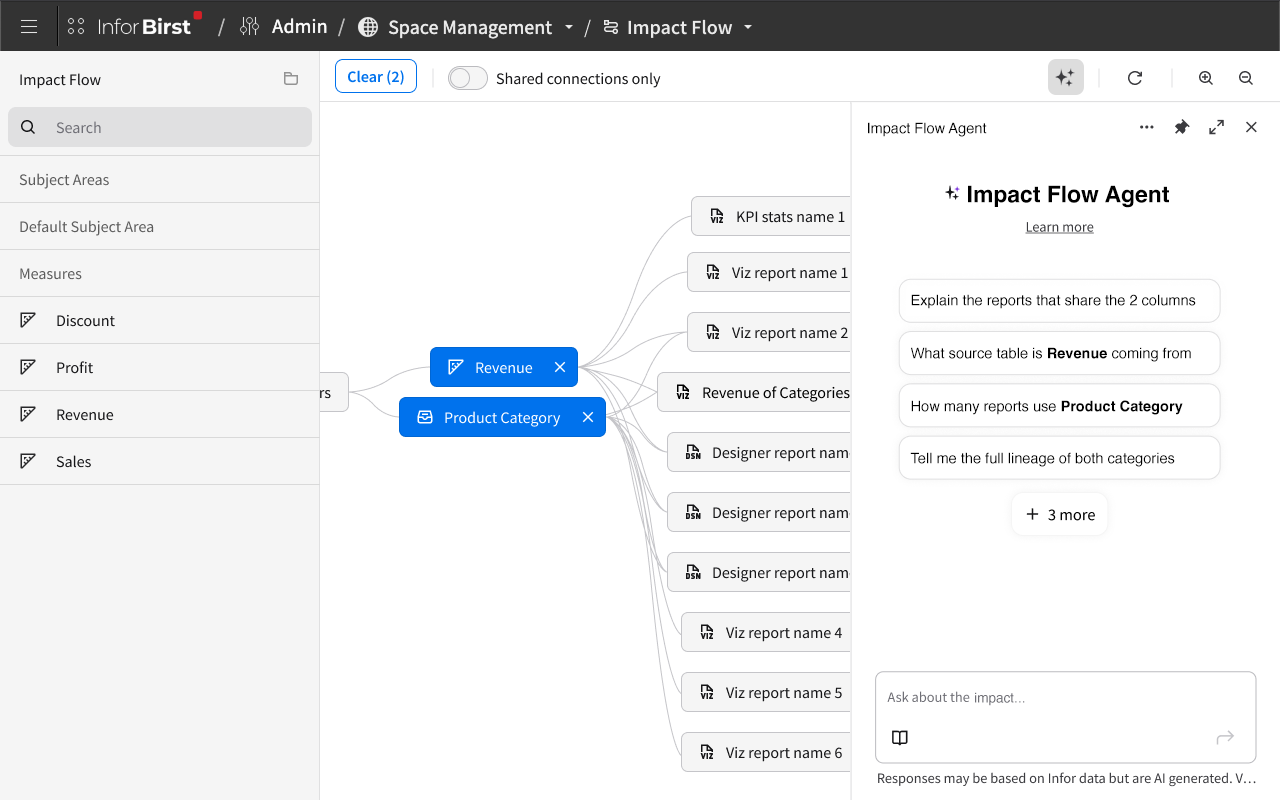
The Impact Flow data-lineage feature included an AI chatbot that let users ask natural-language questions about the connections in their data. (I cover this feature in depth in the Impact Flow case study.)
Design principles
Birst team established
Across these features, the Birst design team converged on a handful of principles for how AI should live in the product:
Opt-in, never forced. Manual input was always the default. Users had to choose to use AI. We never replaced functioning manual flows with AI-only ones.
Editorial control. AI output was always editable by hand. The user could regenerate, undo, or take over directly.
Disclaimers everywhere AI shipped. Every generation surfaced a disclaimer reminding users that AI output could be wrong and to verify before committing.
Admin-level guardrails. Admin users could provide a base context that every AI prompt would consider, narrowing the model's output to the customer's data conventions or the organization's preferred patterns.
Prompt suggestions for new users. Each AI feature surfaced about six example prompts the user could click to populate the input. This helped users learn how to write effective prompts without facing a blank field.
Loading states. A consistent loading animation in the prompt field indicated that generation was in progress, which mattered because AI responses could take a few seconds.
These weren't formal documentation, but they were a shared standard our team applied consistently as new tickets landed.
Example prompts:
The example prompts for each feature were defined collaboratively. We worked with developers to identify phrasing that produced strong AI output reliably, then surfaced about six examples per feature behind a separate button users could click if they wanted them. The examples helped less technical users learn how to phrase prompts effectively without facing a blank field.
Admin-level guardrails: scoping what AI can see
Admins could set which columns the AI was allowed to use and which were excluded. The admin-side UI let them configure these guardrails before any user-facing AI feature went live in their environment. When a user typed a prompt into one of the AI-driven flows, the AI's output respected those exclusions. The user could regenerate or refine the prompt and the AI would stay within the bounds the admin had set.
This wasn't an admin-only feature. The configuration lived in the admin layer, but the impact reached every user of every AI feature in that customer environment. Engineering didn't push back on the architectural complexity because the feature was clearly going to deepen the product's value, and PMs supported the integration as a customer-facing capability.
Designing for AI failure
AI failures got their own visual treatment. When AI generation failed, the output area surfaced a persistent toast message rather than a temporary one, paired with red text and a red outline on the output field to signal the error state clearly. Users didn't have to wonder if AI had silently produced something wrong. The disclaimer covered the broader case that AI output might be incorrect even when generated successfully, particularly with BQL where customer data structures varied so widely that verifying generated code against every customer's data stack wasn't feasible.
Outcome
Several of the AI features I designed have shipped. Others, including the Generate chart from a prompt feature and the saved-expression library work, are designed, PM-approved, and in development at the time of my departure. Birst's release cadence runs longer than is typical at most software companies, and the GenAI pipeline is substantial. However, because Birst has a longer release cadence it opened up opportunities. We could revisit designs still in the pipeline as new ideas emerged. Features that had been designed and approved sometimes got a second pass before shipping when better thinking came up during development. That cycle wouldn't have worked at a faster release cadence, and several of the AI features in the pipeline benefited from late-stage refinements before reaching customers.
The most durable outcome of this work is the prompt-and-edit interaction pattern itself. The segmented-controller pattern for combining manual input with AI generation became a Birst design team standard, applied across multiple features and incorporated into the team's internal pattern library for ongoing use.
Reflection
What I learned from designing AI features at scale is that AI works best as a selectively-deployed helper, not a blanket layer over the entire product. The strongest AI features in Birst are the ones that take a specific tedious task (writing BQL, captioning a saved expression, building a chart from scratch) and offer AI as a faster alternative to a manual flow that still works perfectly well on its own.
I also learned to prioritize integrity in interaction patterns over speed of delivery. The prompt-and-edit approach took longer to design than a simpler "click Generate, accept result" flow would have, but it preserved user control in a way that simpler flows didn't. As AI capabilities mature and customer expectations evolve, that user-control principle is going to age well.
The thing I'd revisit is the chart generator. The current generate from a prompt feature accepts one prompt and produces one result. A conversational version where users could ask for tweaks ("make the bars green," "filter to last quarter only," "switch this to a line chart") and watch the chart update incrementally would have been more useful to the customers requesting the feature. I designed the first pass as a single-prompt experience because that matched what the team had patterns for at the time. Knowing what I know now about how customers actually wanted to interact with the chart generator, I'd push for conversational from the start.