
Pronto (later named Modeler)
Replatforming Birst's data integration from a legacy Flash admin tool into a modern three-part system for connecting, preparing, and relating data from any source.
Role: Co-Lead Designer (1 of 2 designers).
Timeline — 2017 to 2019 (v1 shipped 2019); continued evolution through today.
Team — 2 designers, ~6 PMs, 50+ engineers, 25+ QA; expanded beyond the core team as a company-wide effort, with executive stakeholder involvement.
Platform — Web (Infor Birst BI Cloud Platform).
Status — Shipped and actively in production; later adapted as the architectural basis for Infor's own platform-wide data connection flow.
My contributions — Owned Connect end-to-end; led transform design in Prep (null handling, ignore, filter, merge); co-designed Relate 50/50 with my design partner.
The Problem
Birst's original data integration experience was an aging Flash-based admin tool, built before the company employed any UX designers. It was functional but clunky, unresponsive to the browser, and genuinely confusing to use. Adding a new data source, which was supposed to be one of the most common and important tasks on the platform, was the one our customers dreaded most.
That was a serious problem for Birst's product vision. The platform's competitive edge was its ability to unify data across any source a customer had, from databases and SaaS tools to spreadsheets and APIs. But if customers avoided adding new sources because the experience was painful, we were capping the value they could get from the platform.
Three forces converged to make the rebuild urgent:
Adobe's announcement of Flash end-of-life. Flash was scheduled for deprecation by the end of 2020, and browser vendors were already making it progressively harder to use. We needed to get ahead of the shutdown rather than scramble at the last minute.
Customer frustration was eroding value. Every time a customer avoided adding a new source because the tool was painful, the platform's value proposition took a hit. We were undermining our own differentiator.
Competitors had the advantage of being late. Newer BI platforms had never built on Flash in the first place, so they already had modern HTML-based data integration tools. We were behind them specifically on this workflow.
Constraints and stakes
A few things made this project harder than a typical product redesign:
The scale of what we were connecting to. Customers weren't just connecting to two or three sources. Some had tens, others hundreds, spanning SQL databases, Salesforce, NetSuite, Jira, Google Analytics, REST APIs, JSON endpoints, Dropbox, SFTP drops, the Infor Data Lake, ad-hoc Excel uploads, and Networked BI sources. The UI had to handle that entire range without collapsing.
We couldn't disrupt existing customers mid-transition. The old Flash tool had to keep working for customers who were live on the platform, while the new tool was built alongside it. We designed a seamless migration path where legacy connections continued to function and automatically surfaced in the new experience, giving customers a single source of truth across both tools as they migrated.
Two designers on a massive cross-functional effort. While the project had a dedicated core team, the scope pulled in people from across engineering, QA, and product. It was effectively a company-wide effort, which meant my design partner and I had to design fast, defend decisions clearly, and work with executive stakeholders who were actively engaged in key reviews.
Process and exploration
Getting oriented
We started with a mix of PM briefings, competitive analysis, and our own hands-on testing. The PM team delivered initial scope verbally early on and later broke the work down into Jira tickets per feature. In parallel, we ran teardowns of how competitors handled the same problem, testing data import flows in Tableau, Power BI, Salesforce, and Oracle. We extracted what worked, identified what didn't, and designed our own flow from scratch rather than copying anyone.
The first major decision came quickly: Modeler needed to be three distinct modules, not one monolithic tool.
Connect — establishing and authenticating connections, choosing which tables and columns to bring in
Prepare — transforming and standardizing data after import
Relate — linking sources together into a unified, queryable model
Splitting the workflow this way gave each module a clear purpose and let users focus on one kind of work at a time. My manager assigned initial module ownership between me and my co-designer, and while we bled into each other's work throughout the project, this split gave us the structure we needed to move fast.
How we worked
Our workflow followed a pattern across every feature:
Paper sketches and rough explorations to find the conceptual model
Wireframes in Photoshop (the industry-standard toolkit at Birst in that era, before we moved to Figma later)
Interactive prototypes shared with PMs and the Head of Product for flow review
Iteration based on stakeholder feedback
Engineering handoff with specs and interaction notes
Because the project was so large, we often had multiple features in different stages at the same time, which meant constant context-switching and aggressive prioritization.
[VISUAL: Process artifact grid. 3 to 4 early sketches or wireframes showing iteration on Connect, Prep, or Relate. Captions like "Early Connect source selection exploration" work well.]
Key Design Decisions
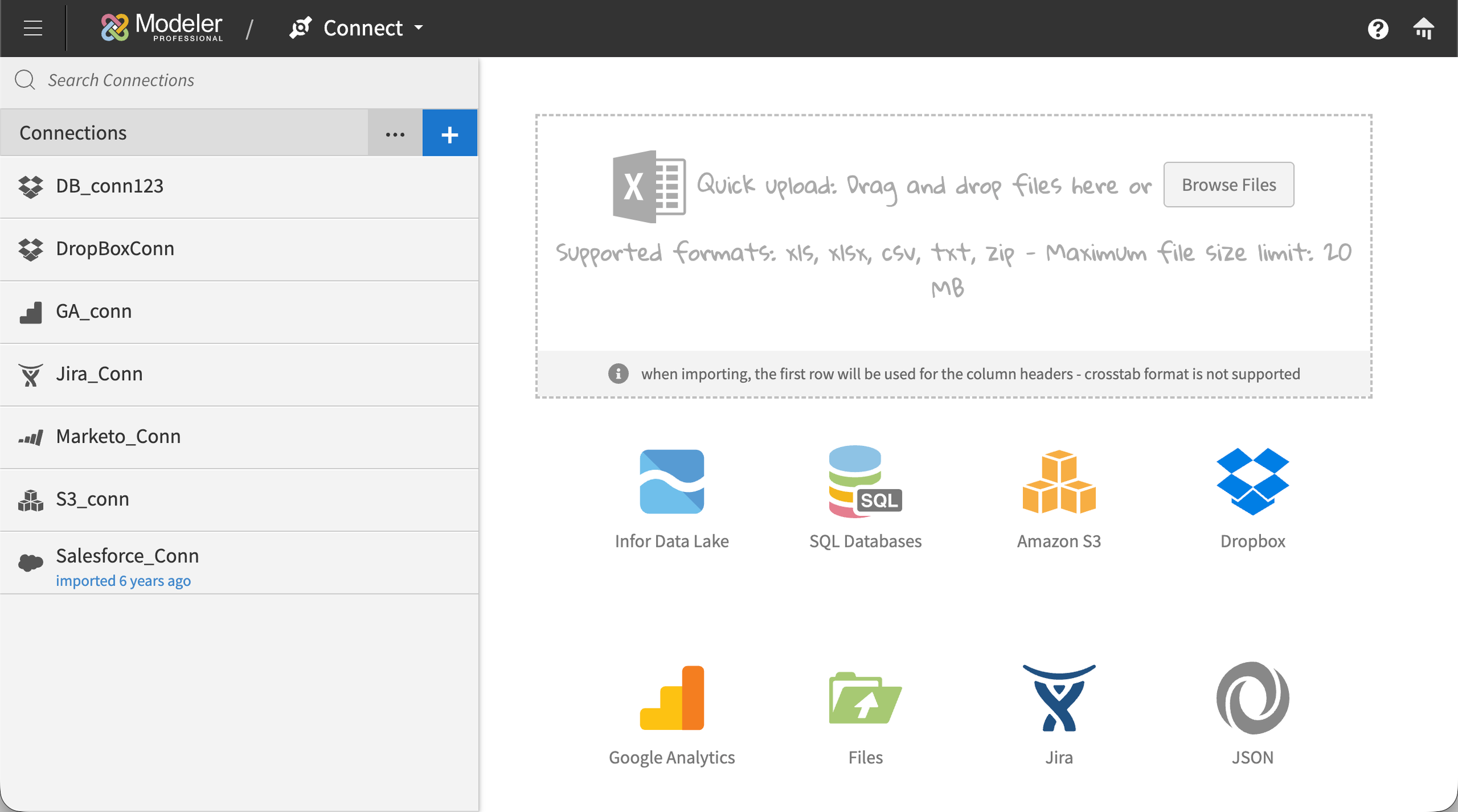
Connect: progressive disclosure for complex setup
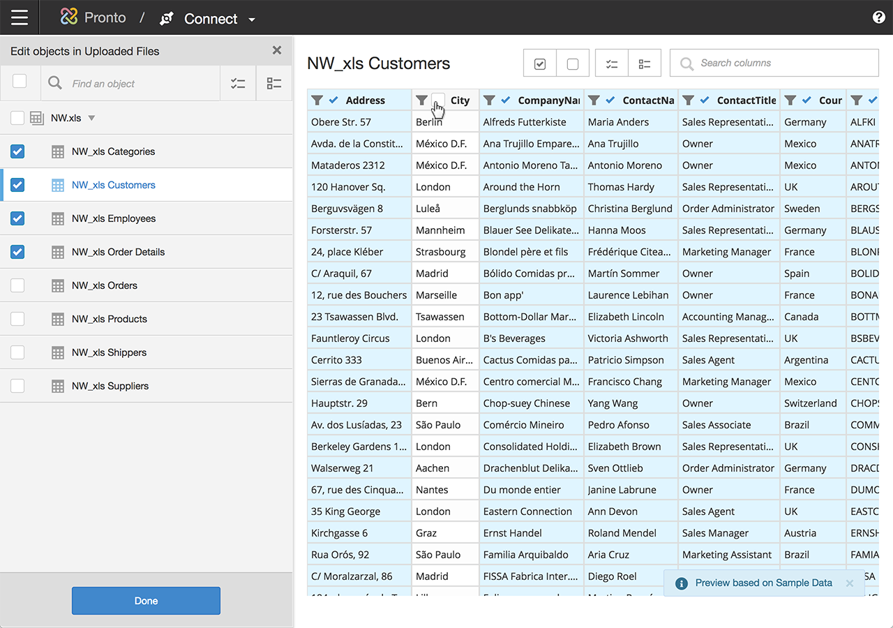
Connect supported a wide range of connection types, including SaaS sources like Salesforce, Jira, and Google Analytics; file-based sources like Dropbox and SFTP drops; API connections like REST and JSON endpoints; SQL databases of various flavors; the Infor Data Lake; and more. Each connection type came with its own configuration requirements, and the list of options varied significantly depending on what the user was connecting to. A SQL database connection might require a server name, host, port, database type, username, and password, with OAuth available as an alternative. A SaaS connection might require Client ID, Client Secret, Endpoint, environment, Account ID, and Role internal ID. A file-based connection had a different shape entirely. If we exposed every possible field up-front, the page would overwhelm anyone setting up their first connection.
The solution was progressive disclosure. Users picked their connection type, named the connection, entered the core credentials specific to that connection type, and then selected the specific tables and columns they wanted to pull. Less common configurations, the ones that only power users or super admins would typically know they needed, lived in a collapsible "Advanced" area that stayed out of the way until someone needed it. This kept the primary flow approachable for typical users without limiting what was possible for technical ones. Some connections, that had support for it, included a "Test Connection" button that validated the inputs before users committed to the rest of the setup.
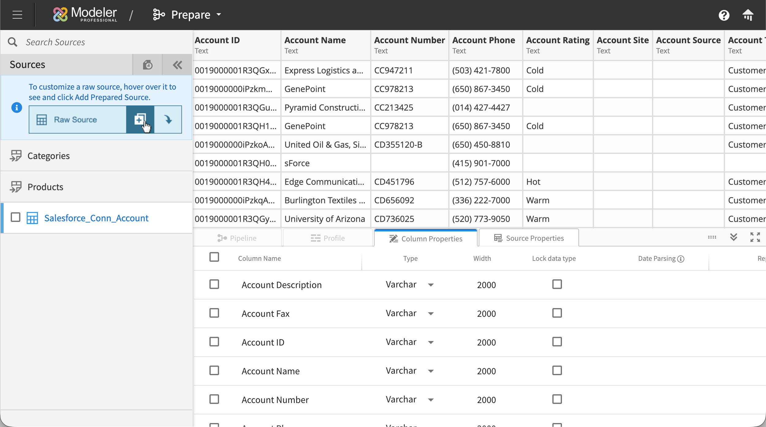
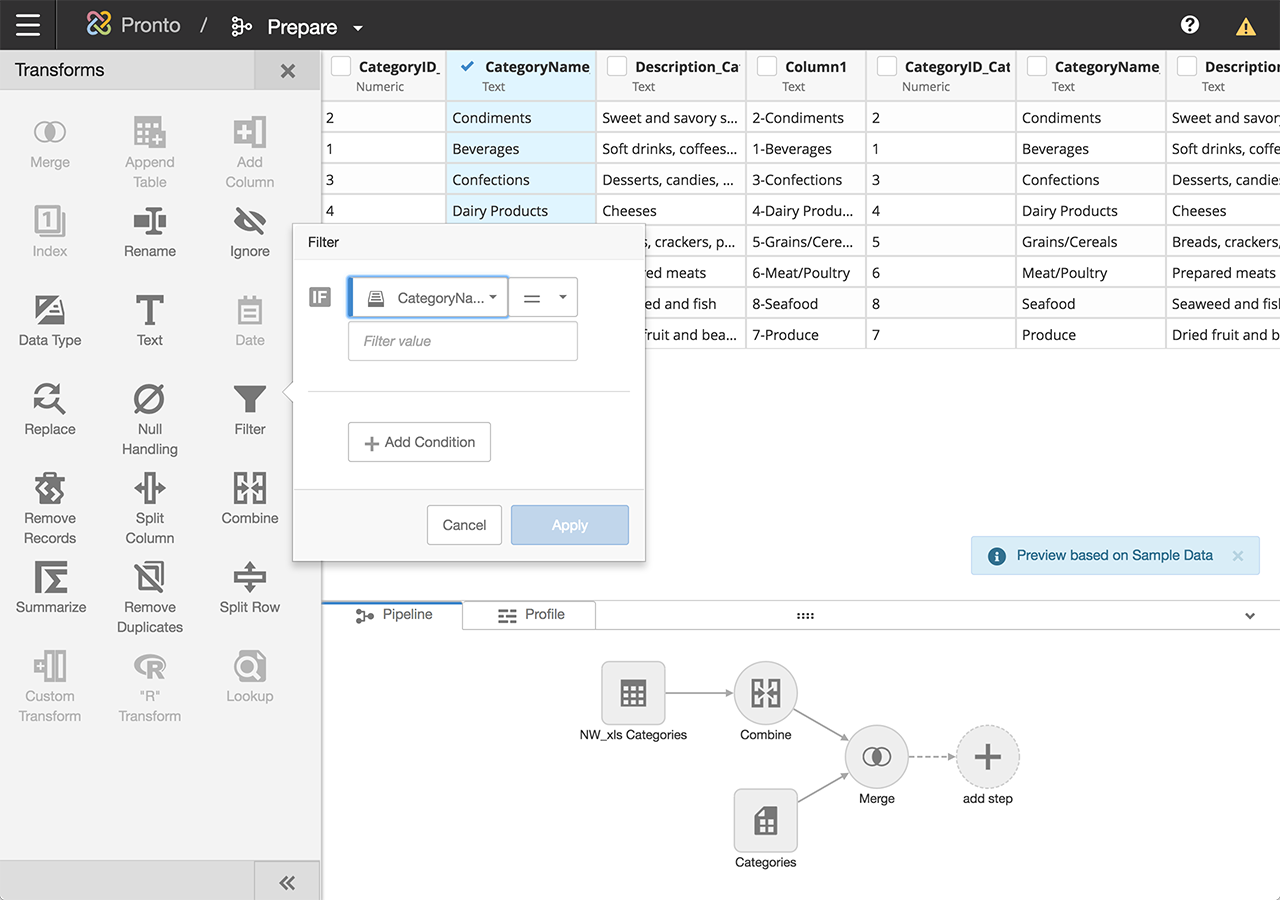
Prepare: making data transformation approachable without hiding the power
Prepare, or ‘Prep’ internally, was where business users ran into territory traditionally reserved for data engineers. Users needed to be able to filter, handle nulls, merge, split, pivot, summarize, rename, and convert data types across tables that could contain millions of rows. We needed non-technical users to feel confident here, without making the tool feel dumbed-down to power users.
Two design choices shaped Prep:
A column-first selection model. Users started by choosing one of the connections they'd already established in Connect from a side panel, then drilled into a specific table from that connection. The selected table's columns and rows displayed in the main area of the screen. From there, users could select one or more columns and apply transforms to them. Relevant transform tools surfaced in a side panel with clear icons for each operation, so the interaction stayed direct: pick the columns you want to change, then pick what to do with them. No hunting through menus.
An interactive transform pipeline. Every transform applied to a table was recorded as a step in a visual pipeline that showed the full lineage of the data. Users could insert new transforms between existing ones, delete steps from the middle of the pipeline, or modify earlier steps without losing the work that came after. The pipeline made it possible to audit, modify, and understand the state of any table at a glance, which mattered as much for one person revisiting their own work weeks later as it did for someone inheriting a teammate's prep work.
Among the transforms I designed directly were null handling, ignore, filter, and merge. Each one needed its own interaction model to feel appropriate to what it did.
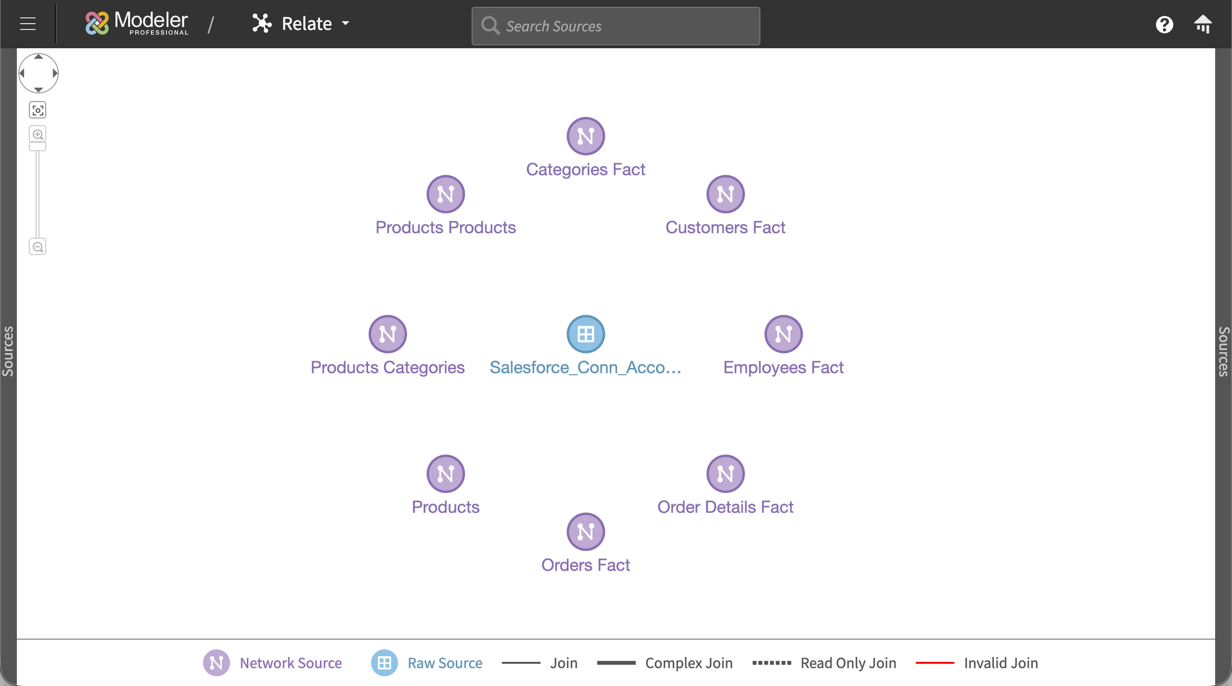
Relate: a visual canvas instead of a join builder
Relate was the module where users connected their sources into a unified data model. Sources could be either prepared sources (those that had been through the Prep module to apply transforms) or raw sources (those imported through Connect that didn't need any transforming and could go straight into Relate). The typical BI pattern for this at the time was a SQL-style join builder: a form or query writer that let you specify joins between tables with dropdowns. A few BI competitors had begun moving toward more visual approaches to connecting sources, but those implementations still came with significant usability limitations.
We chose a visual canvas instead.
The canvas started empty. As users built relationships between their sources, those sources appeared as nodes on the canvas, connected by single lines. Each line represented a relationship between two sources, regardless of how many column-to-column joins actually existed underneath. This kept the high-level star schema legible at any scale, even when the underlying joins were complex.
To inspect or build the actual joins between two sources, users clicked the first source to open a panel on the right, then clicked the second source to open a panel on the left. A transparent white overlay settled over the rest of the canvas, focusing attention on the two panels. Each panel showed the columns of its source. Lines drawn between the panels represented the column-level joins, with Venn-diagram icons in the middle of each line showing the join type (inner, outer, left, right). Users could click any join icon to change the type directly. Each panel could be dismissed independently, returning the user to the canvas view.
The decision to keep join-type icons off the high-level star schema was deliberate. Two sources can have multiple joins between them with different types, and surfacing all of that complexity on the canvas would have created visual chaos and ambiguity. Collapsing to one line per source pair kept the schema readable at a glance, while the panel view preserved the full detail for anyone who needed it.
For users who already knew exactly what they wanted, a SQL join builder is more efficient. But for users who were still figuring out how their data fit together, a visual canvas made the relationships discoverable. You could see what was connected to what, which sources were underutilized, and where gaps existed.
Designing for scale: preventing UI collapse at hundreds of sources
Some customers were uploading hundreds of loose Excel files plus formal data sources, which meant the Relate canvas could legitimately have hundreds of nodes at once. Most visual canvas interfaces fall apart at that scale.
We used a handful of patterns to prevent collapse:
Adaptive node sizing. With a small number of sources, nodes rendered larger with visible source names. As the count grew, nodes shrank and names moved to hover tooltips, preserving legibility across scales.
Color-coded source types. Prepared sources and raw sources rendered differently, helping users distinguish at a glance where each node sat in the data pipeline.
Differentiated line styles. Standard joins, complex joins, read-only joins, and invalid joins each had their own line style on the canvas, so users could spot problems without clicking into individual relationships.
Outcome
Modeler shipped in 2019 and was well-received almost immediately. The pattern was consistent: customers who had been avoiding the old Flash tool started adding connections rapidly, then testing data sources they'd previously given up on. The complexity that had been blocking them was essentially gone. Once customers realized how easy it was to pull in new data, they started exploring use cases they hadn't previously thought were feasible, which in turn expanded their understanding of what the Birst platform could do for their organization.
A few specific outcomes:
Still in production today, with new connection types added continuously. The core interaction model my design partner and I shipped in 2019 has held up across years of feature additions.
Became the architectural basis for Infor's own data connection flow. After Birst proved the model, Infor adapted Modeler's approach into their broader product portfolio, unifying data acquisition across what had previously been siloed products. I worked on that adaptation alongside my co-designer, who led the initial port into Infor's design language.
Customer enablement. By removing the friction of adding sources, Modeler let customers use Birst the way it was meant to be used: unifying everything and asking bigger questions of it.
Reflection
Modeler forced me to learn a system that most product designers never get near. Big data was intimidating when I first joined Birst, and on this project I had to learn concepts that data scientists spend years developing. Like how data is structured, how it flows, how transformations compose, how joins behave at scale. It's rare in our industry for UX designers to dive this deep into the technical substrate of what they're designing. This project made me do it, and I'm genuinely grateful for that.
It also changed how engineers viewed the role of design on the team. I was relatively young in a room of senior engineers, and Modeler was where I stopped being "some designer" and started being a colleague who could actually speak the system's language. That shift of respect was one of the most valuable things I took from the project.
If I were designing Modeler today, the change I'd most want to revisit is row limits. We capped table previews at 100 rows because some of the customer tables were enormous and we needed to protect browser performance. A paging system or lazy-loading pattern would have let users work with more of their data at once without the tradeoff. Infor's later adaptation of Modeler actually improved on our space usage by tightening the transform panel so users could see more of the canvas at once, and that was the right call.
More than anything, Modeler is the project that taught me to hold the whole system in my head while still being able to get granular on a single interaction. Every case study talks about "systems thinking," but this one is where I actually learned what that meant.