

A Complete overhaul
Redesign of Birst
A four year overhaul of the platform's visual identity from themes, chart palettes, icons, and the front door of the product.
Role: Solo lead on the visual systems, co-lead on the space selection screen and the space home page
Timeline: 2022 to 2026, in active rollout at departure
Team: Solo lead on the visual systems, co-lead on the space selection screen and the space home page.
Overview
Over four years, I led the visual redesign of Birst, designing the foundational systems that shaped the product's new visual identity. This included three theme modes, 12 chart palettes, an accent color layer, over 200 icons, and the toolbars and navigation that live across every screen. I also co-led the redesign of the space selection page and space home page, which became the front door of the platform. This work happened in parallel with my other responsibilities at Birst which is why the redesign was rolled out in deliberate chunks over four years rather than as a single push.
The philosophy guiding every decision was to let the data lead.
Letting the data lead
Birst is an enterprise analytics platform. Users spend their days looking at charts, dashboards, and reports. My design point of view across this redesign was to build a visual system that faded into the background so the data could be the hero. Every color, icon, and layout decision was made with that in mind. Restraint at the platform level and expression at the data level. The interface holds a supporting role and the data is the star.
That philosophy shaped everything downstream. The three themes had to work without competing with the data. The chart palettes had to be distinctive from each other while still feeling like a cohesive family. The icons had to guide users toward complex features without shouting for attention. The accent color layer had to let customers brand the product without overwhelming the data underneath.
The three theme system
I designed three complete theme modes across every element of the product: light, dark, and contrast. Every color in each theme was defined by me and applied across every component, panel, toolbar, and canvas surface.
Light is the default and the most polished feel of the three. Standard for daily use and matched the aesthetic that most enterprise BI users expected from a modern platform.
Dark was for lower-light environments and users who preferred it for extended screen time. Every element was recolored, not just inverted, to preserve legibility and hierarchy.
Contrast is not typical for BI. Most products do not offer it. I designed it specifically for two audiences. The first was admins and power users who preferred a utility feel over a polished product feel. Contrast turns Birst into a workstation, not a showcase. The second was accessibility. All three themes pass WCAG AAA (7:1 contrast ratio on normal text), but the contrast theme passes even more dramatically for users with low vision or environmental challenges like viewing dashboards from across a room on operations floors.
The rollout was deliberate. Space selection, the home page, dashboards, toolbars, and the navigation side menu were prioritized first because the majority of Birst users spend their time in the consumption side of the product rather than the editing and creation side. Visualizer and Designer will follow. The order aligned with Infor's broader push to bring their visual identity across our product suite, filtered through Birst's PMs into a phased plan.
Light - Dashboards
Dark - Dashboards
Contrast - Dashboards
The 12 chart palettes
plus a new default palette for Infor
Birst's charts needed color palettes that could work across every chart type, hold up under the three themes, and be flexible enough for customers to match their internal branding. I designed 12 palettes to cover the range of enterprise use cases: Birst Default, cool, warm, fall, strong, dull, neon, aquatic, impact, corporate, pastels, and earth.
Each palette had to solve a specific design challenge. The colors within a palette had to be distinctive enough to differentiate datapoints on a chart (especially when users had ten or more datapoints on the same view) while still feeling like they belonged to the same theme. That balance between differentiation and cohesion is where most palette design falls apart. Getting even ten colors to hold that line was a real challenge. Sometimes I wished the color wheel had more room for what I was trying to do! But, the constraints forced me to push to find the shades that matched well.
Many customers charted their data by month, which meant the palettes needed to support at least 12 distinct datapoints. To cover that and more, I designed each palette as 10 base colors that algorithmically shade to 20 total by darkening the second set by 32 percent. This system covered nearly every real-world use case without requiring a manual second set for every palette.
Customers could pick a palette out of the box, edit specific colors within it and save, or start from scratch and build their own. The 12 palettes shipped as a starting point, not a fixed set.
Every palette was tested for WCAG AAA compliance across all three theme backgrounds using contrast ratio verification. This meant some palettes required adjustment when moving between light, dark, and contrast, and I used shade shifts to preserve impact while maintaining accessibility across every theme.
Beyond Birst, I also designed a new default chart palette for Infor's broader product suite, adopted as the standard across every place charts surfaced in Infor's ecosystem. The design considerations that went into the Birst palettes carried into this work. The distinctiveness across datapoints, cohesion as a theme, accessibility across theme backgrounds, and enough range to hold up for real customer use cases were all part of these decisions. Extending my palette work beyond Birst and into Infor's broader design system was one of the clearest ways the visual redesign influenced the parent company's (Infor) product portfolio.
The palette work was mine end to end, with my manager challenging me throughout as a sounding board. He would push back when a palette felt off or a color choice looked weak, and those conversations sharpened the final work. Every color decision was mine.
The accent color layer
Layered on top of the three themes was a user selectable accent color. This was an Infor driven concept designed to let customer’s companies feel present in the product without the visual system changing dramatically. A light nod to their brand.
Infor defined the eight accent colors: blue, red, green, orange, purple, teal, yellow, and neutral. My work was in deciding where those accent colors lived in the Birst product. I chose the surfaces where an accent color would land intentionally without overpowering the data, and tested each color across all three themes to ensure it read as intended regardless of the base theme. Admins could set a default accent color for their organization, but individual users could override it just as they could choose their own theme. The accent color layer respected user choice while giving customer organizations a way to personalize the platform.
Light theme - Red accent
Dark theme - Blue accent
Contrast theme - Teal accent
The new space selection page and space home page (co-led)
Before the redesign, Birst's login flow was awkward. After signing in, users saw a side panel with an empty page waiting for them to select a space. Once selected, another side panel level appeared with the list of products, and only after selecting a product from that panel would it collapse and load the actual product on screen. There was no home page at all.
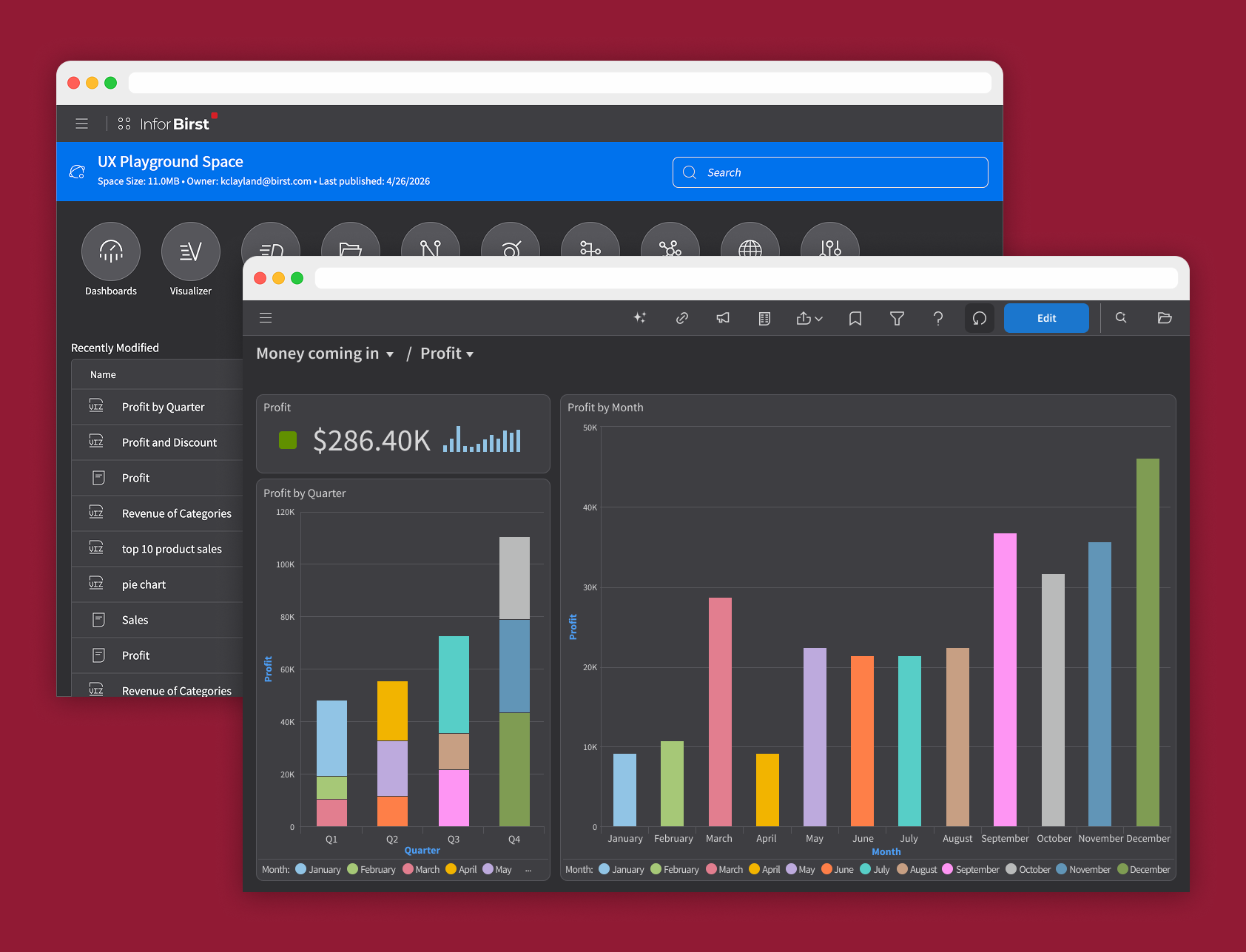
I co-led the design of a new space selection page and space home page. The space selection page became the first landing screen after login and gave users a clear, dedicated surface to choose their space or dive into higher level tools. The space home page then loaded as the space's dedicated home, showing all of the products and modules within that space alongside a list of recently modified dashboards, viz reports, and designer reports. Users could jump directly into the specific item they were last working on instead of navigating through a two-step process of opening a product and then finding the file.
The space home page also included in-line search across saved items in every product. Search results actively populated in a dropdown as users typed, letting them jump into a specific report, dashboard, or visualization from anywhere in their space. Customers were thrilled with the search addition after it shipped.
Both pages became the first surfaces to fully implement the new theme system and accent colors in production, effectively the hero moment of the redesign.
Space selection page
Space page
The icon system
Birst is deliberately icon-heavy. That was a design philosophy my manager instilled early in my career at the company and one I saw prove itself over 12 years. Each feature carries an icon that gives it a distinct visual identity and hints at what the feature does. This is especially important for less technical users, where the industry-standard names for BI features can be intimidating and unwelcoming. An icon lowers the barrier to entry by giving users a visual cue before they read a label.
Icon design was a weekly practice on the Birst design team. Every new feature required at least four icon options before we landed on the final choice after tweaks, and design critiques were a key part of the process. I redesigned over 200 icons across the toolbars, navigation, product menus, and product-specific surfaces.
Infor provided some baseline rules on icon design, including line thickness and corner radius, but the guidance was limited and left significant room for interpretation. Birst used a larger icon size than Infor's standards, which meant many icons needed to be simplified when adopted from the Infor library. Since icons carry a lot of meaning in a small surface, reducing complexity while preserving intent was a real challenge. Some icons had to be conceptually rethought when simplified.
I set additional rules for spacing, alignment, and where the rounded corner treatment lived on each icon shape, since Infor's guidance did not include patterns for these decisions. Those rules became the standard for Birst's icon design going forward.
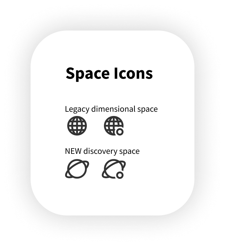
A small craft moment I am proud of: The redesign introduced a new type of space that handled data modeling differently than the legacy space type. Legacy spaces kept their existing icon. The new space type needed something that signaled its distinct nature. I designed a Saturn-inspired icon that gave the new space type a modern, distinctive character. I also designed the ownership indicator for spaces, a small circle on the bottom right of the space icon. On the Saturn icon, the ownership circle reads like a moon orbiting the planet. It was a fun exploration I got to partake in and let me get just a little more creative during the hard work of redesigning complicated technical feature icons.
Accessibility as a foundation, not an afterthought
Every color decision across the redesign was tested against WCAG AAA standards (7:1 contrast ratio for normal text) using contrast verification tools. This included every element in every theme, every accent color paired with every theme, and every chart palette color rendered against every possible theme background. When a color did not pass, I adjusted with shade shifts to preserve the design intent while meeting the accessibility bar.
Accessibility was not a compliance checkbox at the end of the process. It was a design constraint from the first decision.
What is still shipping
At my departure, the visual redesign was in active rollout. Space selection, the home page, dashboards, toolbars, and the navigation menu were fully themed across light, dark, and contrast. Visualizer and Designer are the next surfaces to receive the theme treatment. The standards, rules, and design language were set. The rollout is ongoing.
The systems were built to hold up as the rest of the product catches up to them.