
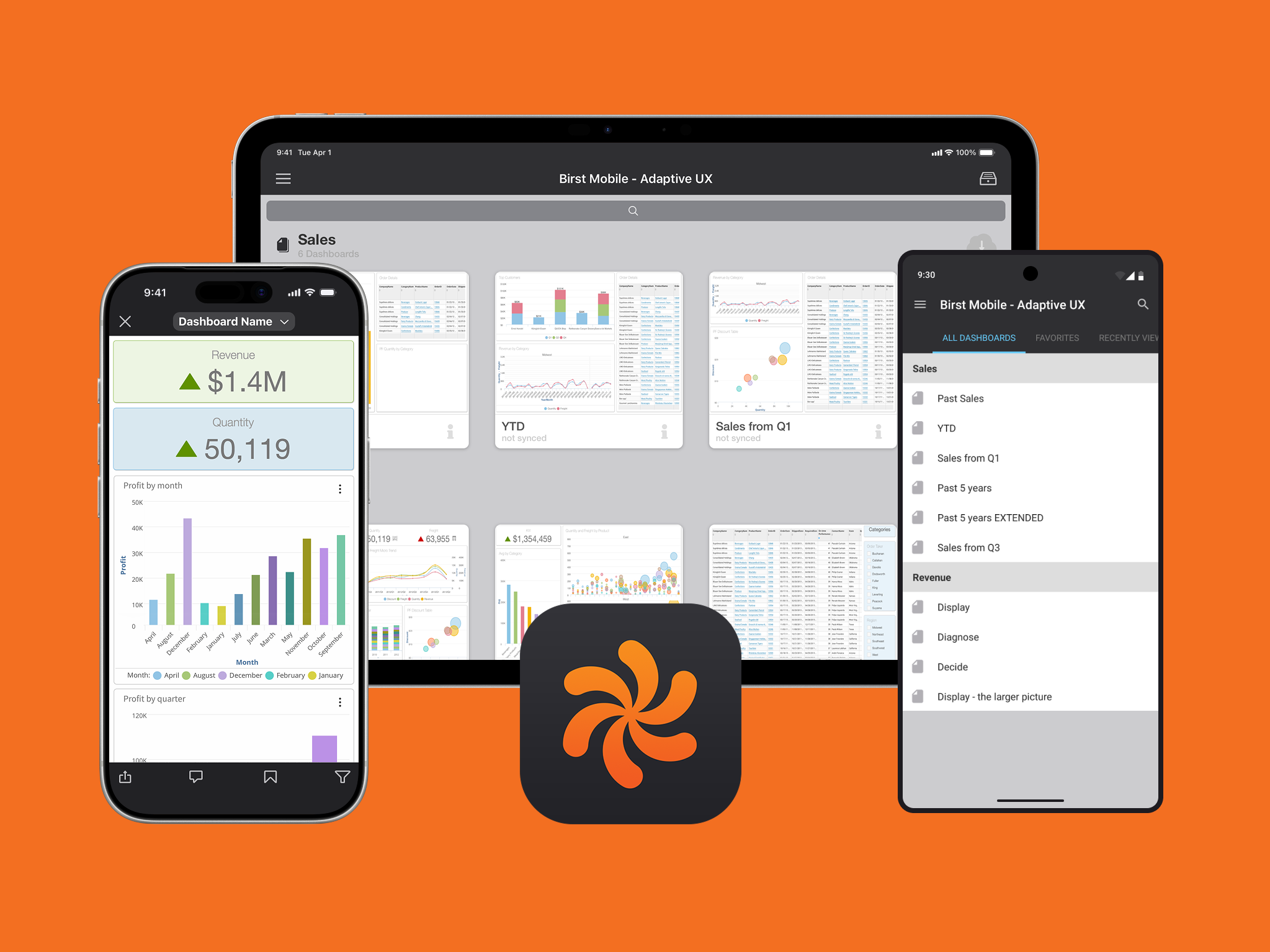
Birst Mobile Suite
A ground-up mobile BI product for iPhone, iPad, and Android, designed as the sole designer over more than a decade. Shipped to customers including United Airlines, Disney, Topgolf, and Clarks, and recognized by Forrester and Dresner as a category leader in mobile BI.
Role: Sole designer
Timeline: 2014 through 2025; active design phase 2014 to 2017, ongoing feature ownership through my last day at Birst
Team: Me, one iOS engineer, one Android engineer, plus backend and frontend support and product management
Form factors: iPad, iPhone, Android tablet, Android phone (plus an Android TV variant prototyped at a company hackathon)
Recognition: Forrester Wave Cloud BI Leader 2015, Dresner Wisdom of Crowds #1 Cloud BI for four consecutive years (2012 to 2015)
Customers: United Airlines, Disney, Topgolf, Clarks (deployed across every Clarks retail storefront), and 10+ whitelabeled deployments for major enterprise customers
App Store ratings: 4.7 on iOS, 4.6 on Google Play
The problem
In 2014, mobile BI was a category that existed mostly in name. Competitors had mobile apps, but they tended to fall into two camps. Some were watered-down report viewers, useful for reading static charts but useless for any actual analysis. Others were poorly adapted desktop interfaces, technically full-featured but completely unsuited to a touch screen. The category was wide open for a company that wanted to design for mobile first.
Birst's web product was already differentiated for its strong UX in a market full of dense, technical BI tools. But the company's reputation as a mobile-first BI vendor had to be earned. Birst hired me as the sole designer to build the mobile suite from the ground up, with full design authority across every form factor.
The bet was strategic. If executives could check key metrics on a phone in an airport lounge, if a sales rep could pull up a dashboard at a client site, if a warehouse worker could filter live data with a barcode scanner, that would change what Birst was as a product. The app wasn't going to be a companion to the web product, it was going to redefine what the product was and could do.
Designing across four form factors
The mobile suite wasn't a single app. It was four distinct products that needed to feel like one cohesive system while respecting the conventions of each platform.
The iPad app came first, in 2014. The iOS engineer and I spent months on its core navigation, working through animation experiments and interaction patterns until we had something that felt right. The Android tablet app started about two years later, after we'd nailed the iPad's foundational layout. From the moment the Android engineer joined, I designed for iOS and Android in parallel.
A point I want to be clear about: we didn't copy iOS designs into Android with a different color palette. The iPad app was built in iOS flat design, and the Android tablet app was built in Material Design. Both engineers and I were committed to respecting each platform's conventions. We didn't cut corners on Material Design. Buttons, transitions, navigation patterns, elevation, ripple effects, all of it followed Google's spec. At the same time, the apps shared a uniform Birst design language across both platforms, with the same information architecture, same feature set, same visual identity. Users moving between an iOS phone and an Android tablet would recognize the product immediately without feeling like they were using a less-polished port.
The iPhone app started as a hackathon project. I built a working prototype that used the existing Birst APIs and rendered actual dashboards on the device. We presented to leadership with a live demo, won the top prize, and were green-lit to ship the app properly. Executives loved it for the same reason the eventual app shipped to broad acclaim: someone could check their dashboard on a phone, anytime, anywhere. The Android phone came shortly after.
We later prototyped a fifth form factor, an Android TV app in another hackathon. The use case was warehouse-floor displays, where dashboards refreshed at a customizable interval to surface changing data through the workday. It demonstrated how far the underlying design system could stretch.
Once all the apps were live, every new feature followed the same workflow. I designed for iOS first across both phone and tablet, then designed for Android across both phone and tablet, ensuring platform-native expression of the same underlying concept.
Key design decisions
The Browse Screen
The Browse Screen was where users found their dashboards. It used a horizontal-scrolling grid of cards organized into Collections (folders that contained related dashboards). Users could scroll left through a Collection's contents, or scroll down to see additional Collections.
Two design decisions defined this screen.
First, auto-generated dashboard thumbnails. When a user opened a dashboard, the app captured a screenshot and stored it as the dashboard's thumbnail in Browse. This was a first at Birst. Before this feature, dashboards were represented by generic icons, which made finding a specific dashboard among dozens difficult. With thumbnails, users could recognize their dashboards at a glance. I designed placeholder thumbnails for the period before a dashboard had been opened, so the screen never looked empty.
Second, the flip animation. Each dashboard card had an information icon. Tapping it triggered a card-flip animation: the card rotated to reveal a back face with details about the dashboard, including the names and types of every chart on it, the individual dashlet’s creator, and set as Home toggle, Favorite button, and a way to Sync a dashboard. On iPad, the flipped card grew into a standard modal as it animated. The flip was something I pushed hard for against initial pushback from engineering. It worked because it was tactile, it preserved the user's spatial sense of where they were, and it made the metadata feel discovered rather than imposed.
The Filter Panel
The mobile filter panel was designed for users who weren't necessarily admins. Field reps, warehouse workers, executives. They needed to be able to filter dashboards quickly and confidently without learning a query language.
The defining design choice was that filters read as natural language. Reading a measure filter top to bottom would say "Sales greater than or equal to 10,000." An attribute filter would say "Product category equals Furniture, Technology, Appliances." Each filter was structured as three vertically-stacked elements: the filter name (the column being filtered), the operator (greater than, between, equals, etc.), and the value the user selected. The structure was the sentence.
Filter types included:
Attribute filters with multi-select checkbox interactions
Measure filters with a slider or a dual knob vertical slider for numeric ranges. For "between," two white knobs anchored a blue range with grey ranges outside. For "outside," the colors inverted. The visual semantics of selected vs. excluded ranges were immediately readable.
Date filters with a native date picker
Value filters for direct user input, including a barcode scanner integrated into the filter via the device's camera
Filter groups for combining filters into folders
Parent-child filters for hierarchical drill-downs like Year → Month → Week → Day
The barcode scanner was a customer driven request from a major retail and warehouse customer. Their use case: an employee walks through a store or warehouse, scans a product, and the dashboard immediately filters to that product's data. Sales by month for a specific item, instantly. Multiple scans were possible to filter to multiple products at once. The camera viewport opened inline within the filter panel so the user never left the module.
The filter panel layout itself went through significant iteration. The first version was a single column popover with a back button to navigate between filters. I didn't like that pattern. It hid the rest of the user's filters every time they were configuring one. I redesigned the panel as a Master Detail layout, inspired by Apple's Settings app on iPad. The list of filters lived on the left, the configuration for the selected filter lived on the right. Users could see all their filters at a glance and configure any one of them without losing context.
Filters combined with AND logic. The Apply button stayed visible across the entire panel.
The Fan Menu
A persistent design tension on a mobile dashboard is screen real estate. Each chart on a dashboard is a "dashlet," and dashlets are small. Putting an icon strip on each one for "filter", "change chart type", "create notification", etc. would have cluttered every chart on every dashboard.
The Fan Menu was the answer.
When a user pressed and held a finger on a dashlet, the rest of the dashboard darkened, indicating that the menu applied only to the held dashlet. A radial menu appeared with three actions:
Visual filter: The user could draw a box around chart elements directly on the chart to filter to just those elements. It would then render to just the selected elements a user wanted, it made selective filtering instant.
Column selector: The user could change the columns driving a chart to see different cuts of the data. A Sales by Month chart could be switched to show Profit by Month instead, or the timeline could shift from Month to Year or Week, all without rebuilding the chart from scratch.
View selector: The user could swap chart types from bar to line to column to table, and so on. The menu only displayed chart types that were valid for the chart's columns and how they were used, so users couldn't pick a chart type that would break.
Create notification: The user could schedule the chart to be sent to themselves or a team via email at a chosen frequency (hourly, daily, weekly, monthly, yearly) with options for file format (PDF, PowerPoint, Excel), compression, applied filters, and start and end dates. As new data populated into their cloud, they could receive a new snapshot as time progressed.
Information: The creator of a dashboard could add a description on a dashlet for the end user who is out in the field. This is where those end users, could access that information in a modal.
The Fan Menu hid powerful capabilities behind a single touch interaction, keeping dashboards clean by default and revealing capability only when invoked. Because it relied on a non-standard interaction, I designed coachmark screens that introduced the Fan Menu when a user logged in for the first time. Once shown, users picked it up quickly based on user interaction data.
Storytelling
Storytelling came later in the product's life and was inspired directly by Offline Mode. Once Offline Mode existed, dashboards could be cached as renderable saved states. Storytelling extended that capability into a presentation tool.
A user created a Story by opening a dashboard, configuring it with the filters and settings they wanted, then tapping "Add Slide" to capture that state as a card in a horizontal trough at the bottom of the screen. They'd then load a different dashboard, configure it, capture another slide, and so on. The result was a sequenced flow of dashboard states.
In play mode, the slides moved to the top of the screen and auto-hid, and arrows surfaced for navigation. The user could differentiuate between e. The "Add Slide" button disappeared, and the visual mode shift was intentional. Users needed to know whether they were creating or presenting, because the consequences of an accidental change in either mode were very different.
Stories were saved locally on the device and could be shared with members of the same Birst Space. They couldn't be exported. They lived natively in the Birst app, which was the right tradeoff because Storytelling depended on real interactivity and up to date data. A frozen export would have lost the point.
The use case was sales reps in the field. Tablets at the time didn't have cellular connectivity, and many client sites had locked or weak Wi-Fi. With Storytelling and Offline Mode together, a rep could walk into a meeting, open a Story on their iPad, and present an interactive multi-dashboard narrative without depending on a connection.
Creation
Presentation
Offline Mode and the Cache Manager
Offline Mode was an industry first. Most BI products at the time were strictly online. Birst's mobile app rendered cached dashboards from a lean on-device data store, and any state a user reached while online (loading a dashboard, applying a filter, opening a bookmark) was automatically captured for later offline access.
The Cache Manager UI gave users visibility and control. A pie chart showed the ratio of cached data to cached images (since dashboards could include image assets). A horizontal storage bar, modeled on Apple's iOS storage UI, showed how much of the device's total storage Birst was using, alongside the rest of the device's data. Users could adjust the cache retention window and clear the cache entirely.
When a user attempted to render a dashboard that wasn't cached, the app surfaced an explanatory error and instructions for how to remedy it. Synced dashboards were marked with a status icon on the Browse Screen so users knew at a glance which dashboards were available offline.
Whitelabeling
Birst's mobile app was deployed under at least 10 customer-branded variants, used internally by major enterprise customers who wanted brand cohesion in their internal tools. These were the kinds of customers who didn't want their sales reps walking into a meeting with another company's logo on the screen.
The technical infrastructure for this was a theming system the iOS engineer and I built together. Every visual element with a configurable color was tagged in a centralized XML file that defined the theme. Hex codes, image assets, login flows, splash screens (which doubled as privacy screens during multitasking, hiding sensitive dashboard data behind the customer's logo), app icons, login backgrounds, and the menu logo were all defined per theme.
I built a Photoshop workflow with recorded actions that exported a logo or icon at every required resolution and added the appropriate Apple suffixes (@2x, @3x) automatically. Android required even more icon sizes than iOS, and the same automated export workflow saved enormous time. Once a theme was defined, I could change a hex code, boot up the iOS Simulator from Xcode, and see the new color treatment live, then iterate against the customer's brand guidelines.
The first few whitelabels were manual. After about four customers, we'd refined the system enough that adding a new whitelabel was significantly faster, and we shipped each one to that customer's own Apple Developer Account and Google Play Developer Account, releasing under the customer's branding while we handled submission and approval.
Mobile native by design, not by adaptation
A point worth emphasizing: the mobile app was not a port of the web product. We used a web wrapper to render the actual dashboard canvas and charts (because the chart engine was too sophisticated to rebuild natively), but everything else, including all panels, chart tooltips, navigation, modals, and controls, were native iOS or native Android. From the user's perspective, the wrapper was invisible. The design decisions I made around how the chrome looked and behaved made the app feel native end to end.
A representative example of how I fought for this was around chart tooltips and the fan menu that appeared when users interacted with a chart. The faster path was to just use what already existed in the web product. Charts already had web-rendered tooltips and inline icons for chart actions in the dashlet headers. Reusing those would have meant zero new engineering work on the native side. Some on the team wanted to take that shortcut.
I pushed back hard. Web tooltips on a mobile device read as web tooltips, not as native UI, and the difference is something users feel even if they can't articulate it. Inline action icons in dashlet headers also didn't make sense on mobile, where vertical space was at a premium and headers needed to stay clean to display dashlet names. Building native tooltips, native action menus, and the Fan Menu (described above) meant more engineering, but it also meant the interactions felt like iOS on iOS and Android on Android. That work became the precedent for everything else.
From that point forward, the principle held: every element that appeared on top of or around the webview canvas was native. Tooltips were native. Modals were native. Filter panels were native. Navigation was native. Toasts, alerts, sheets, popovers, settings, browse, share dialogs, all native. We didn't skimp on a single interaction surface. The result was an app where the only thing rendering through the wrapper was the dashboard canvas itself, and even that was framed by native chrome that maintained the platform's expected behavior in every direction.
I also designed a full mobile version of Birst's Visualizer (the web product's chart-authoring tool), redesigned for touch-first interaction. The PMs ultimately decided not to ship it. The use case for authoring full visualizations on a mobile device was thin, and the engineering lift was substantial. The design exists as a complete artifact in my files.
Outcome
The Birst mobile suite shipped to customers including United Airlines, Disney (specifically Disney Interactive), Topgolf, and Clarks (deployed across every Clarks retail storefront), as well as 10+ whitelabeled deployments for major enterprise customers, and many more of our long list of customers that decided to opt into the mobile suite.
The app maintained App Store ratings above 4.5 stars throughout its life, and as of my last day at Birst, it sat at 4.7 on iOS and 4.6 on Google Play.
A representative App Store review:
"I have tried just about every BI app for my company's Enterprise BI program for executives and managers. This app beats them all and is easy enough to use that the executives are actually using it on a daily basis now as their go-to information source."
A Google Play review captures the cross-device experience:
"Very slick experience, especially when switching between my PC browser, my iPad, and then my Nexus 6P: responsive design means that the KPIs are set up front and center for my phone which is exactly what I want. The fact that I can build a dashboard for one, and know it will automagically realign for phone without any additional design work, that's huge. Big fan!"
The mobile suite was repeatedly cited as a competitive differentiator in analyst recognition for Birst, including the Forrester Wave Cloud BI Leader designation in 2015 and Birst's #1 ranking in Dresner's Wisdom of Crowds Cloud BI Market Study for four consecutive years (2012 to 2015). It was a noted differentiator leading up to Infor's acquisition of Birst in 2017.
The interaction architecture I designed has endured through Infor's later visual refresh of the app, which restyled the visual surface to match Infor's broader product family. Every feature I designed remains in the product today.
Reflection
Designing as the sole designer on a multi-platform product for over a decade taught me to view a product in its entirety. I had to know every corner of the app, because I was the one accountable for its design from end to end. Each feature I brought from the web product, I redesigned for mobile-native interaction rather than porting. I innovated where mobile demanded it and respected web conventions where users would benefit from continuity.
I also learned to take critique seriously. Sometimes I had ideas I thought were great that weakened under scrutiny in design reviews. I learned to check my ego at the door. If a room of stakeholders disagreed with a direction, I iterated. When I knew a design was the right call (the hamburger menu, thumbnails, the card flip, the segment boundary input on the gauge chart in Birst's web product), I held my ground with documented reasoning. Wiki pages I created tracked every iteration, every change, and the reasoning behind it, so I could argue from documented history rather than memory.
The mobile suite expanded who used Birst. Salespeople walking through a customer's office, executives checking KPIs on a flight, warehouse workers with a barcode scanner, retail managers at the back of a Clarks storefront. Users who would never have logged into the web product were suddenly Birst users. The mobile apps revolutionized the product's surface area in the market.
What I'm proudest of is that I didn't feel overwhelmed. As the sole designer of a multi-platform suite that shipped to global brands, I had a lot to prove. The thing I'm proud of is that I trusted my research, my craft, and my instincts, and the design held up. Industry analysts agreed. Customers agreed. The product agreed by lasting more than a decade with the core architecture I designed.