
Impact Flow
A data-lineage visualization module for the Birst analytics platform that lets admins and end users see how every column, filter, report, and dashboard connects, surface duplicates, and understand the downstream consequences of changes before they happen.
Role: Lead Designer (sole designer)
Team: 1 PM, 4 engineers, 1 designer (me)
Timeline: Designed in a single rapid iteration cycle as my last major project as Design Lead at Infor Birst
Scope: Full new module from a written PM concept through approved production-ready designs, including the canvas visualization, side panel and entry points, hover and click interactions, destructive-action confirmation flow, and AI chatbot integration
Status: Designed and approved for production, in development at the time of my departure, expected in the next major release
The problem
Birst's customers tended to be very large organizations, and over time their data environments accumulated clutter. Users could create reports and filters in personal storage, but they also worked in shared spaces where filters and reports were visible across teams. People built duplicates without realizing it. Two analysts on the same team would create slightly different versions of the same Sales by Region report, or a filter that was nearly identical to one that already existed. Storage allotments filled up. Shared workspaces got harder to navigate.
Even when duplicates weren't the issue, customers struggled with two related problems:
They couldn't see what depended on what. A user looking at a report had no easy way to know which dashboards used it, which filters were applied, or which underlying columns it pulled from. End users in particular often didn't have access to the data preparation modules (Pronto/Modeler), and even if they did, those tools were built for data engineers, not for the business users one or two layers further downstream.
They couldn't see the impact of destructive actions. Going to delete a report or a filter meant guessing at what might break elsewhere in the platform. Birst already had a delete-confirmation modal that listed affected items in plain text (a feature I had designed years earlier), but a list of names doesn't communicate the structure of how things connect. Users would still hesitate, or worse, delete and learn the consequences after the fact.
The pain was real and primarily about clutter and confidence. Storage was a secondary concern. The real ask was: help users understand their data without having to open the data prep tools they often weren't authorized to use.
What I started with
The concept came in as a written ticket, not a sketch. PM described the need for a tree-style canvas that would let users see lineage paths through the platform. There was no UX direction beyond that. The full module had to be designed from a few paragraphs of requirements.
I spent the first part of the project deciding on the structural shape of the visualization. Infor's design system included a tree component, but it had been built for organizational charts where each node represents a person and the hierarchy is shallow. It wasn't suited to the dense, multi-stage data lineage Impact Flow needed to render. I borrowed a few ideas from how it laid out connections, but the rest had to be built from scratch within Infor's broader visual style.
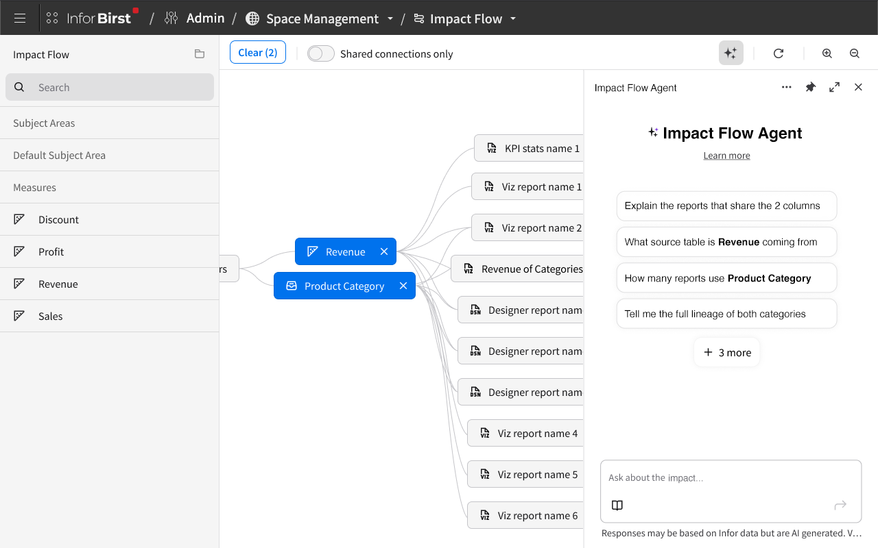
The structure: a horizontal flow
I chose a horizontal layout that flows from left to right, mirroring reading direction. The flow goes:
Sources → Tables → Columns and Filters → Visualizer reports and KPIs → Dashboards
Each stage occupies its own vertical column on the canvas, with related items stacked together. Sources sit on the far left. Tables fan out from them. Columns (measures and attributes) and filters sit in the middle. Visualizer reports and KPIs come next. Dashboards anchor the right side.
The horizontal direction was deliberate. Column names can be long, and stacking them vertically within a flow stage kept names legible without horizontal truncation. It also meant lineage paths read in the natural direction of "this data started here, and was used over there."
Items within each stage are grouped by type but not crowded. They're spaced to feel like distinct entities rather than a wall of nodes. Connections between stages render as flowing lines, with the slope of each connection adjusted to the natural geometry of where the connected nodes sit. There are no arrowheads, because the flow direction is unambiguous: sources are on the left, dashboards on the right. Adding arrows would have been visual noise.
Each node is a rectangle or pill shape containing the item's name and an icon indicating its type. Unlike Modeler's Relate canvas (where nodes were dots and the names sat next to them, allowing nodes to shrink under density), Impact Flow's nodes carry their own labels. They couldn't shrink past readability, so the canvas adapts in different ways at scale.
Where it makes sense, nodes also carry quick-action buttons. A Visualizer report node has a button to open the report in Visualizer. A dashboard node has a button to open that dashboard. Users can move from understanding lineage to acting on the underlying objects in a single click, without leaving the module to navigate manually.
Two entry points
Users can populate the canvas in two ways.
Drag-and-drop from the subject area. A side panel on the left mirrors the subject area panel that users already know from Visualizer and other parts of the product. They can browse columns by subject area, select them via checkbox, or drag and drop them directly onto the canvas. The familiar pattern means users don't have to learn a new interaction model to start working.
Browse the report catalog. The same side panel offers a Browse button that opens the report catalog (a feature I'd been the lead designer on years earlier). Users can pick any saved report and see its full lineage, both upstream (what columns and filters it uses, along with the source of those columns) and downstream (what dashboards it appears on).
The canvas itself also surfaces a Browse button in its empty state, giving users a second prominent path to the report catalog without forcing them to find it in the side panel. Empty states are easy to underdesign, and I wanted the empty Impact Flow canvas to feel inviting and direct, not intimidating.
The same module is also accessible inline from delete-confirmation flows, which I'll come back to in a moment.
Real-time rendering: winning the engineering argument
A significant design decision was how the canvas should behave when users added or removed items.
Engineering's initial preference was batch rendering. Users would add multiple items, then click a Render button to draw the full lineage in one operation. Their concern was performance. If a user added five columns and we re-rendered after each addition, that was five render passes. They worried about latency at scale.
I'd designed a read-only preview of this same lineage data years earlier (the inline mini-view that appears in delete-confirmation modals), so I had a sense of how lightweight the underlying lineage queries actually were. The data was relatively cheap to fetch. The canvas wouldn't be doing heavy processing on every change.
I proposed a test. If a single render pass took longer than three seconds against realistic customer datasets, we'd ship batch rendering with a Render button. If it came in under three seconds, we'd render in real time, every time the user added or removed an item.
It came in well under three seconds. We shipped real-time rendering, which removed the most awkward part of the original proposal: a Render button that interrupted the user's flow and asked them to remember when to press it. The canvas now updates the moment something changes, which makes lineage exploration feel direct rather than transactional.
The toolbar held only what was needed: zoom controls, a refresh button, a clear-all button, and the toggle I'll describe next.
Hover, click, and "shared connections only"
The canvas could accumulate dozens of nodes once a user added several columns or reports. A handful of interaction patterns kept it navigable.
Hover-highlighting. Hovering over any node darkens that node's full lineage path (everything connected upstream and downstream) while desaturating the rest of the canvas. The unrelated nodes get a darker outline so they remain visible as context, but the user's attention is pulled to the chain of connections that matters. This is the primary interaction for picking out a single lineage from a dense canvas.
Click-to-persist. Clicking a node makes the highlight stick. Users can pan around the canvas to follow long lineage paths without losing the highlight. Clicking elsewhere or clicking the same node again clears it.
Shared connections only. A toggle in the toolbar limits the canvas to nodes that two or more items have in common, stripping the connections on the canvas that they do not share. This was one of the most quietly powerful features in the module. If a user adds five columns and toggles Shared Connections only, they immediately see which reports use combinations of those columns. If two reports remain connected after the toggle, they're likely duplicates of each other and users could open those reports to check for themselves. If a filter has no remaining connections under this toggle, it's a candidate for deletion because it wasn’t being used anywhere. Shared Connections turned a visualization tool into a duplicate-detection tool.
Destructive-action safety
Impact Flow itself is read-only. Users can explore lineage and understand impact, but they can't delete from inside the module. The actual destructive actions still happen where they always did: in the report catalog for reports, on dashboards for filters.
What changed is what users see when they trigger those deletions.
The delete-confirmation modal for reports and filters surfaces a clear question (something along the lines of "Are you sure? X items will be affected") and presents the affected items in two tabs:
A text-based display listing every dashboard, filter, or downstream item the deletion will affect, styled to make the affected items immediately recognizable
A mini Impact Flow rendering the same information visually, using the same conventions as the full module
The visual tab is helpful when the list of affected items is large, because seeing the structure communicates differently than reading a list. An "Impact Flow" link lets users escalate to the full module if they want to explore further before deciding.
The flow is intentionally a one-way door. Once a user confirms a delete, the action commits. There's no undo and no rollback. The entire purpose of the modal redesign was to make the consequences of deletion clear up front, so the irreversibility never comes as a surprise.
Original design for viewing delete conflicts.
New, additional way of visualizing delete conflicts.
The AI chatbot
The chatbot was a PM-driven request, and a thoughtful one. The premise was that even with a clear visualization, users navigating a complex web of interconnections would sometimes want to ask questions in natural language rather than parse the canvas visually.
The chatbot lives in the toolbar near the zoom controls. Clicking it opens a side panel with a text input and roughly six recommended starter questions ("How many reports use this column?", "What dashboards would break if I deleted this filter?", "What sources contributed to this report?"). The chatbot stays disabled until the user adds at least one item to the canvas, because it needs context to be useful.
This is a conversational chatbot, not a one-shot prompt. Users can ask a question, get an answer, then ask follow-up questions to explore deeper. If a user asks "what dashboards use this column" and the response includes five dashboards, they can follow up with "which of those are most heavily used" or "which use this column in a filter vs. as a measure" without restating context. This is the version of conversational AI I'd wanted to design earlier in the GenAI work, and Impact Flow gave me the chance to do it.
The chatbot was built as opt-in. The canvas was designed to be self-explanatory without it, and many users would never need it. For users who did want to ask questions in their own words, the chatbot was a natural extension of the same lineage data the canvas already surfaced.
Outcome
The full module is designed and approved by product management, in active development at the time of my departure, expected to ship in the next major release. The mini Impact Flow embedded in the delete-confirmation modal will ship alongside the main module.
Impact Flow is designed to serve admins, end users, and everyone in between. Admins get a tool for understanding the structure of the data environment they manage. End users without access to the data preparation modules get a way to understand where their data comes from. Anyone going to delete a report or filter gets a clear view of what they're about to break.
Reflection
What I learned designing Impact Flow is how many distinct paths users can follow through the same lineage data. A column, a filter, a report, a dashboard each become a valid entry point into the same web. Designing the canvas meant designing for all of those entry points without making the tool feel different depending on which one a user started from.
If I started over, I'd push for four changes:
A collapsible side panel so users could give the canvas more room when they need it
A mini-map viewport showing the entire canvas with a marker indicating the current view, so users know there's more outside their current pan and which direction to move
The ability to manually drag nodes to create custom groupings, with a reset-to-default option for restoring the structured layout
The ability to perform destructive actions directly inside Impact Flow rather than only in the original report and filter screens. The PM team kept Impact Flow read-only to scope the project, but if any tool in the product is set up to communicate the consequences of deletion, it's this one. Letting users delete from within the module would close the loop between understanding impact and acting on it.
Impact Flow taught me, more than anything, that systems thinking doesn't end with the abstract. The interconnections in a customer's data environment are real, large, and mostly invisible until something breaks. The job of a feature like this is to show users what their data depends on before they discover it the hard way. That's what every Impact Flow design decision was trying to do.